I implemented my cleartype for images idea and here are the results.


![]()
![]()
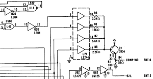
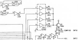
(This image, by the way, is part of the schematic of the original IBM CGA card - specifically, the composite DAC stage which I've mentioned before.)
The first image was resampled by Paint Shop Pro 4.12 (I know it's ancient, but I never got on with any of the newer versions). This resampling algorithm works directly on the sRGB values (it's not gamma corrected) so whenever there's a grey pixel in the output image, it's too dark.
The second image was resampled using proper sRGB<->linear conversion and an ideal sinc filter (which means it's very slow - several seconds per image). If you zoom into this, you'll notice some "ripples" around the horizontal and vertical lines which are due to the band-limited resampling - getting rid of them would require higher spatial frequenices than this image can accurately reproduce, so really the image is about as correct as it can be. Because the ripples are clipped on the high side, this does make the image slightly darker on average than it should be, but the difference isn't noticable to the human eye).
The third image was resampled by the "cleartype for images" algorithm (again with a sinc filter in linear space) using a band-limit of the subpixel resolution. As you can see, it's noticably sharper but does have annoying "fringes" of colour as thin lines move from one subpixel to another.
The fourth image is the same as the third except that the band-limit is that of the pixel resolution rather than that of the subpixel resolution (but the filters are still centered on the subpixels for the corresponding channels). This completely eliminates the fringing (yay!). As expected, it's not actually sharper than the non-cleartype image but some of the near vertical lines are smoother and the text is much more legible than any of the other versions.
Here's the same four methods with a colour image:


![]()
![]()
First let's look at the one with incorrect gamma - notice that a lot of the sharpness in the detailed regions is gone.
The second image is much better - the details remain sharp.
The third image is a mess - details exhibit aliasing problems because when the image has detail in just one channel, the band-limit frequency is three times the pixel frequency.
The fourth image is pretty similar to the second but there are a few places where sharp, near-vertical lines are a bit smoother, for example the brightly lit part on the left of the hat.
So, I think this experiment is a success. The downside is that I now need to go back through all my previous blog posts and resample the images again to improve them.
"I now need to go back through all my previous blog posts and resample the images again to improve them."
Might I suggest choosing a different wordpress theme first? An 800-pixel-wide column doesn't leave a lot of room for images, no matter how they're resampled. Maybe a variable-width theme, so that images can be as large as you like and they'll get resized (by the browser, natch) depending on the individual viewer?
BTW, does your cleartype resizing assume LCD panels only, or is it a method adaptable for CRTs as well?
Updating the wordpress theme is on my list of things to do to this blog. I'm leaning towards the "Twenty Eleven" theme, but I want to make a custom banner for it, which involves writing a collage-making program, and to do that I want to sharpen some tools first (improve the type system I use for config files). So a simple theme update has kind of gotten out of control. That's all on hold for some XT work in the meantime, though. I'm currently trying to figure out why one of my Arduino delay loops seems to be delaying for much too long, causing the BIOS to fail to recognize the keyboard sometimes. Not that I really need that if I'm driving the machine via the manufacturing test protocol, but I just can't let it rest until I solve it.
However, I do have some wide images on this blog that I don't want to downsample, so I tweaked the CSS a bit so that the wide images appear at full size (but are still centered with respect to the column). If you spot any wide images on here where I've missed the style class so they get downsampled to fit the column, please do let me know.
Like all Cleartype implementations, it assumes individually addressable subpixels (i.e. LCD panels). On CRTs it should look no worse than non-Cleartype resizing, but the main advantage isn't there. On LCDs with the pixels sideways or upside-down (i.e. BGR order instead of the normal RGB), it'll look worse. I actually think Cleartype resizing looks slightly better than non-Cleartype resizing even on CRTs, but that may be some sort of placebo effect - I can't think of any theoretical reason why this might be.
I can still see quite noticeable fringing on the fourth image, despite my LCD monitor using -- AFAICT -- a normal horizontal RGB sub-pixel pattern (although even with a magnifying glass it's quite hard to tell!). It's nothing fancy, and several years & technology iterations old.
I took a photo which I think is just about good enough to see the effect: http://panic.cs-bristol.org.uk/~jules/20111005_002.jpg
I'm not sure cleartype ever looks very good on this monitor though. I suspect it may have internal filtering which thwarts it somehow...
I see the same fringing on my monitor as well. It's there on the OS-generated text bitmaps on my screen as well, so I think I've just stopped noticing it. I think it's a second order effect caused by the red, blue and green subpixels not being the same brightness (and possibly also the gaps between them not being equal). I did an experiment once with a black line on a magenta-ish background and I could get the fringing to completely disappear that way. I'm not sure if it's possible to get the second order fringing to disappear while avoiding any global colour bias.